Process
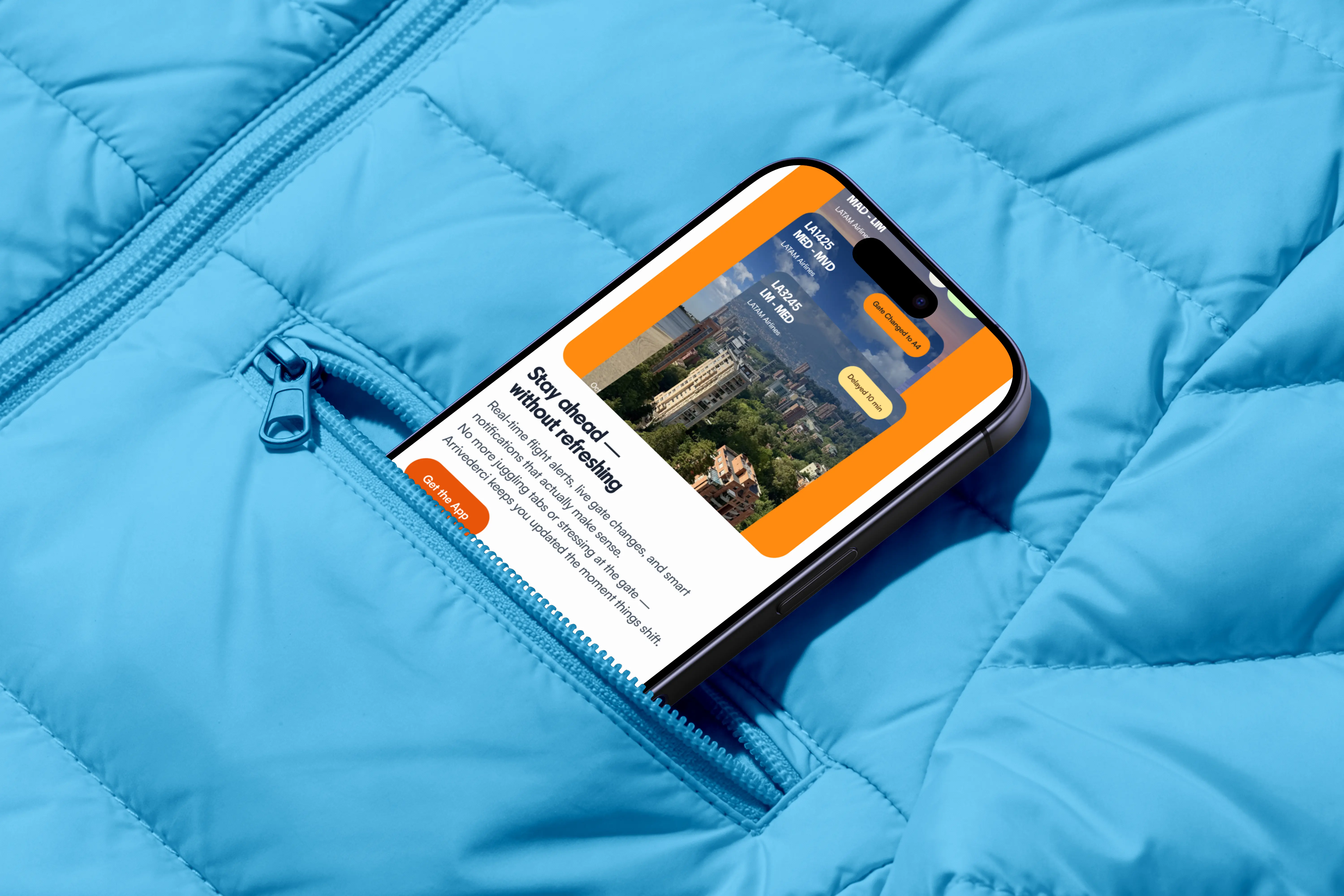
The name came first. Arrivederci — Italian for "see you again," a warm goodbye that doubles as a promise to return. Being in Italy when it clicked made it feel right. That one word set the emotional tone for everything: a brand that moves with people, feels human, and speaks across cultures. The visual system followed — a bold, alive color palette built around combinations rather than individual colors, Parafina for display with warmth and confidence, Satoshi for body with clarity and calm. Tone and voice matched: youthful, encouraging, never corporate. AI helped throughout to validate color accessibility and fine-tune typographic proportions, keeping every pairing AA compliant.
Execution highlights
Full design system delivered — color palette, typography scale, tone & voice guidelines, moodboard, sitemap, low-fidelity wireframes, and a high-fidelity responsive landing across desktop and mobile. All components built with Auto Layout in Figma, reusable and systematized. Interactive prototype included.
Role & Team
Solo — brand naming, visual identity, UX structure, UI design, mini design system. Delivered as a design challenge for Litebox.
Timeline
3 days, Taormina, Sicily
Stack
Figma, AI-assisted accessibility checks