iSono

Review speed
Less than 20 seconds to determine whether a patient requires medical attention
Workflow efficiency
70% reduction in clicks to reach a relevant slice, by integrating AI findings directly into the scrubber.
User preference
100% of radiologists preferred the new flow in user testing
Process
I started by breaking the existing layout entirely. Before proposing anything new, I interviewed radiologists, breast cancer surgeons, and imaging specialists — understanding their workflow, their frustrations, and the cognitive weight of reviewing scans under time pressure. I benchmarked the competition and found the same weaknesses everywhere: poor clarity, small interaction zones, no hierarchy, no sense of what mattered first. That research became the foundation for a completely new interface logic — one designed around the constraint that a doctor might have one glance to catch something critical. We ran 4 prototype iterations and 2 rounds of user testing, validating every decision with the people who would actually use it.
Execution highlights
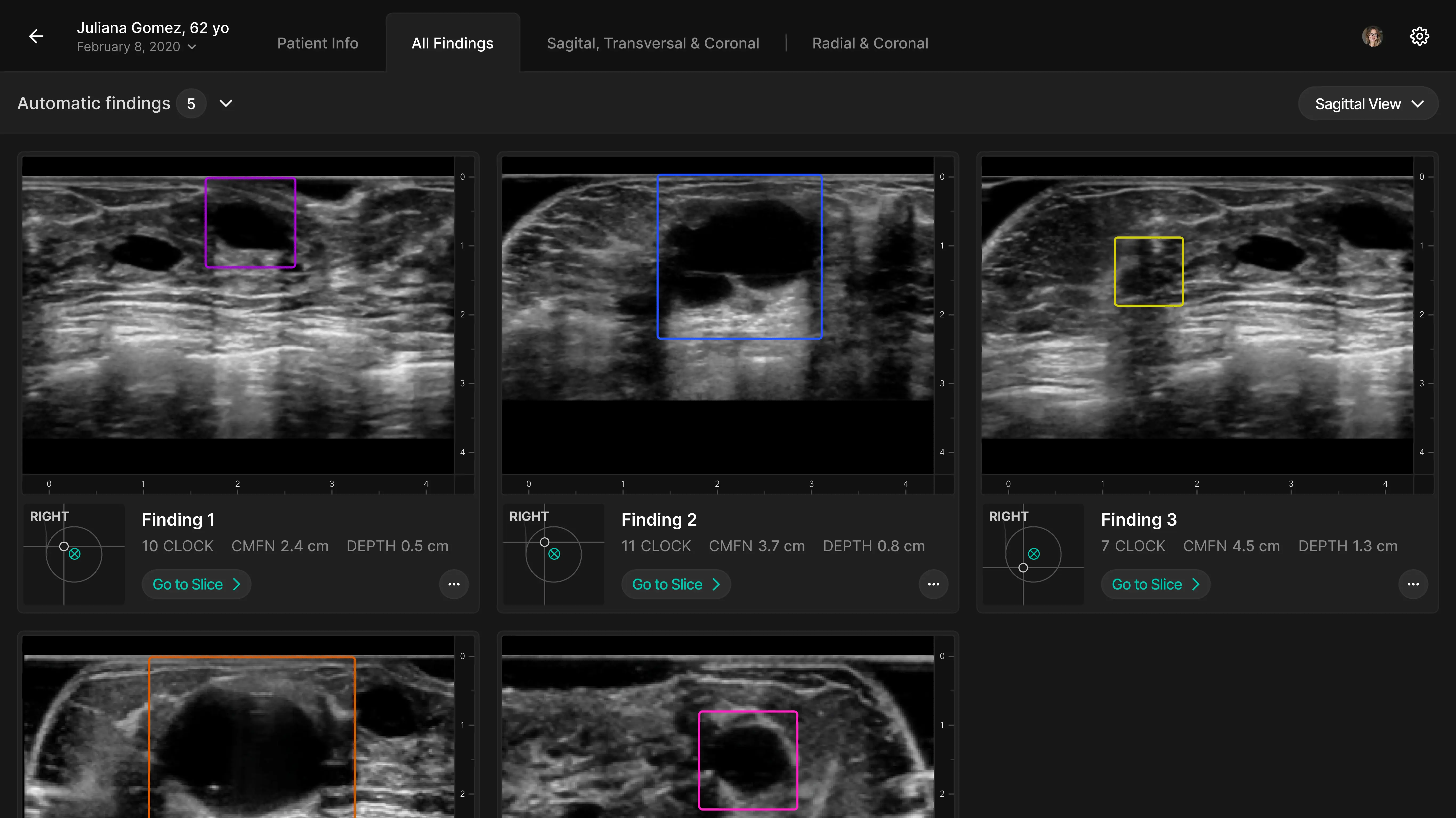
The redesigned interface surfaces only AI-flagged 3D images first, reducing the volume of slices to review before a radiologist decides to go deeper. A rebuilt Scrubber lets doctors navigate between image planes quickly and correlate findings without losing context. Interaction zones were enlarged, cognitive load was reduced, and the entire flow was simplified — fewer clicks, clearer hierarchy, faster decisions. All validated by medical professionals.
Role & Team
Sr. UI Designer at Arionkoder — UX research, interface redesign, prototyping, user testing. Working alongside a Product Manager and an ML Engineer.
Timeline
8 weeks end to end
Stack
Figma / Framer